Saje Wellness
C H A L L E N G E
Saje was mid-evolution: a beloved Canadian wellness brand that had recently modernized its visual identity and was continuing to scale into the US market. The packaging team’s job was to hold the line on that new visual language across a vast catalog of SKUs, while simultaneously meeting two distinct sets of regulatory requirements (Health Canada NHP standards and US compliance), hitting per-unit cost targets, and delivering on the brand’s genuine commitment to sustainable, minimal-waste packaging. Seasonal and limited-edition lines added another layer. They needed to feel distinct enough to drive purchase, but coherent enough to live within the brand.
Embedded within the in-house packaging team, I designed and produced packaging across core and seasonal product lines, from initial concept through production-ready files, dieline testing, and overseas manufacturer approval.
Every structure had to earn its place: we were designing self-closing, minimal-glue dielines that protected product integrity without compromising the brand’s sustainability values, and every decision was made with cost, compliance, and shelf presence in mind.
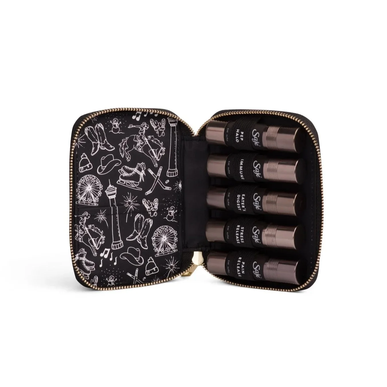
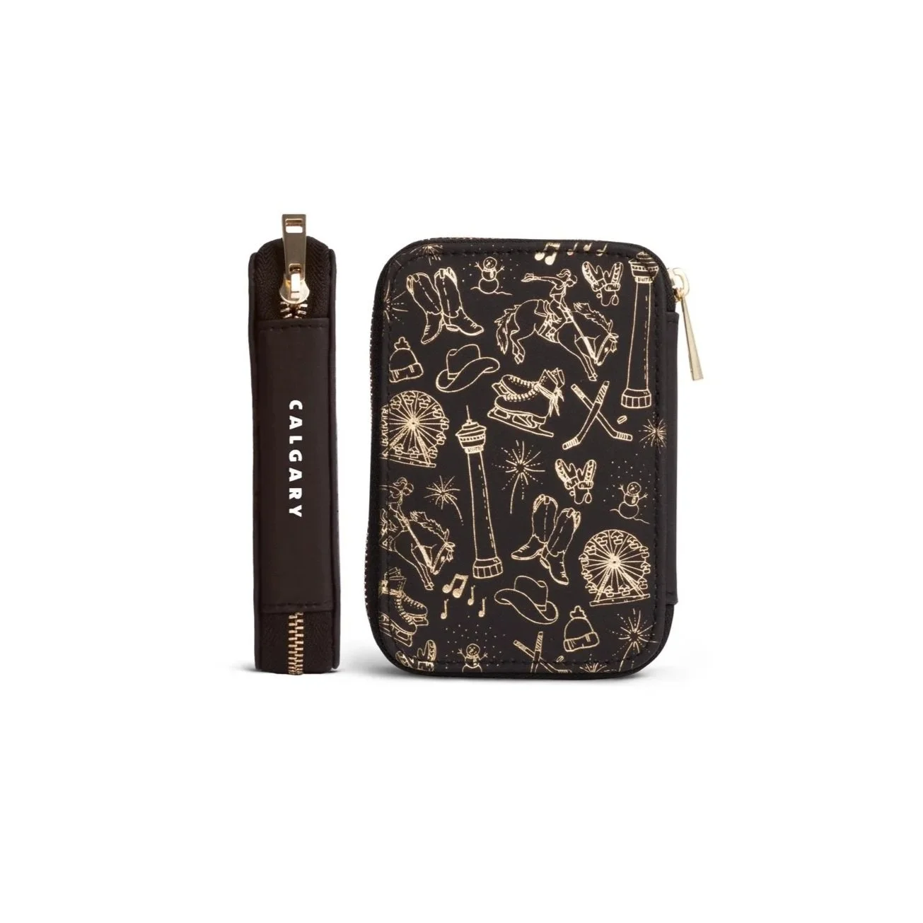
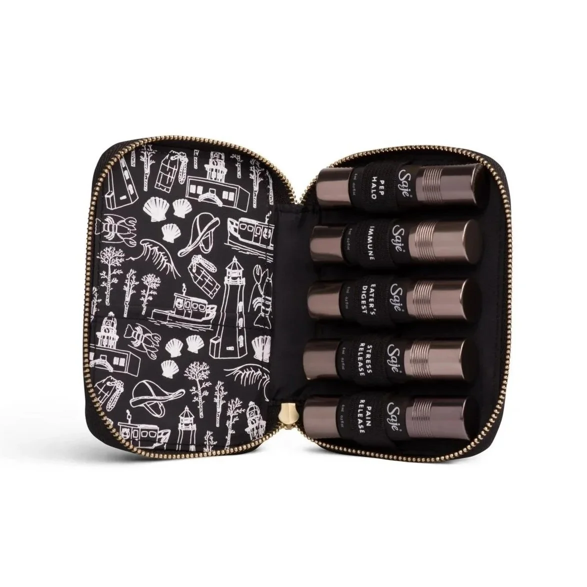
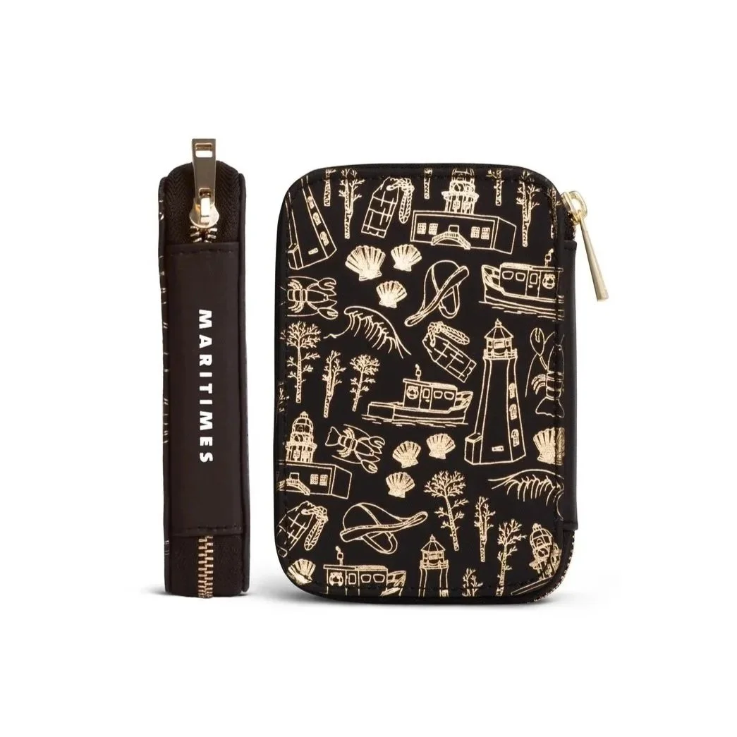
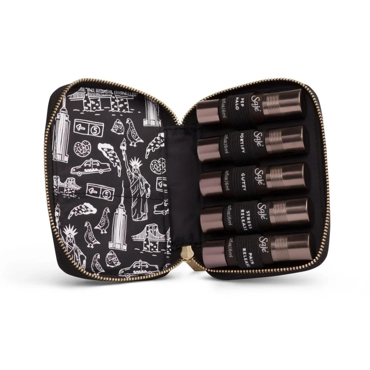
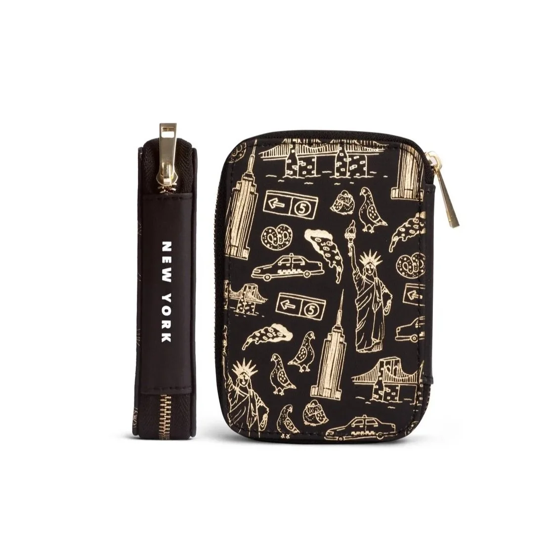
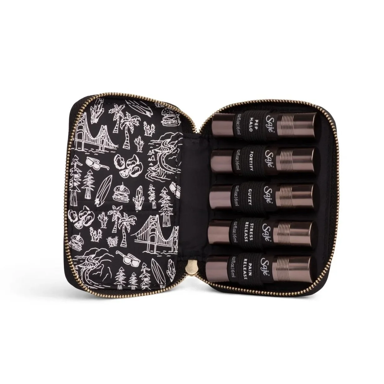
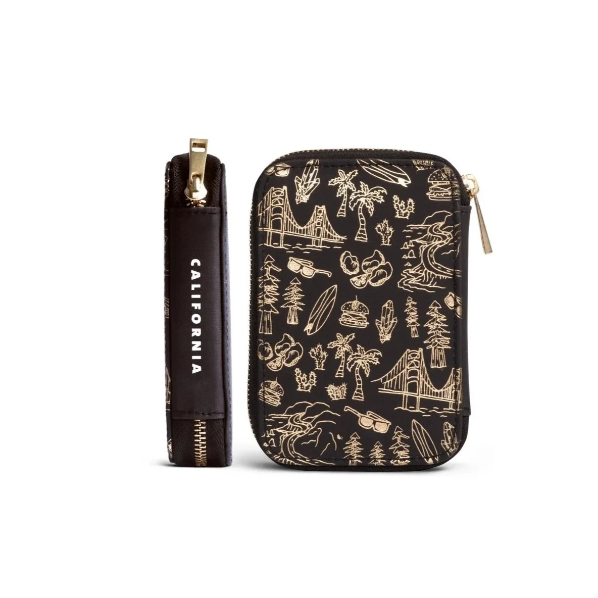
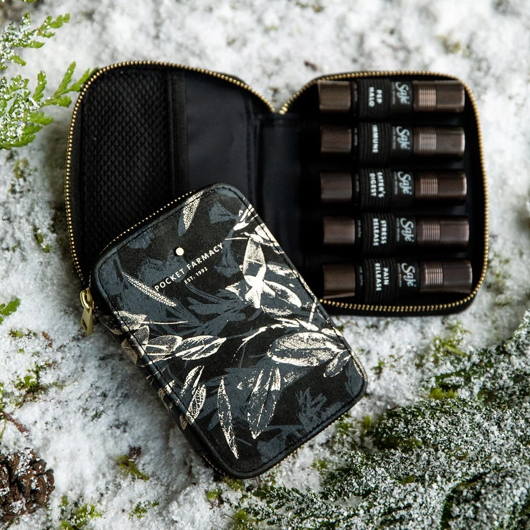
2019 Pocket Farmacy Illustrations were all hand illustrated myself based on iconic city features and community lifestyle.
T H E W O R K
S E R V I C E S
Packaging Design
Graphic Design
Illustration
Print Production
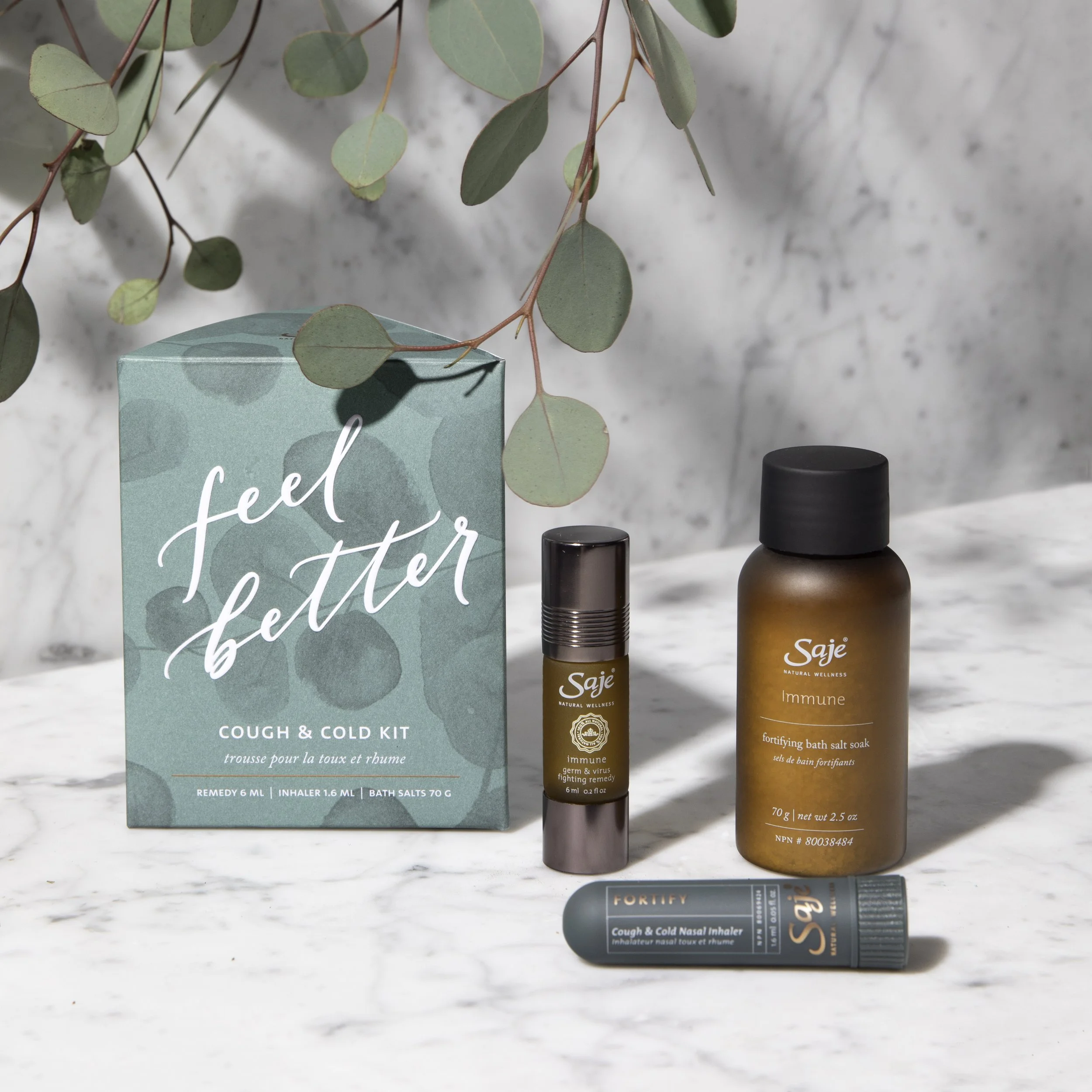
CAD Packaging - Seasonal Premium
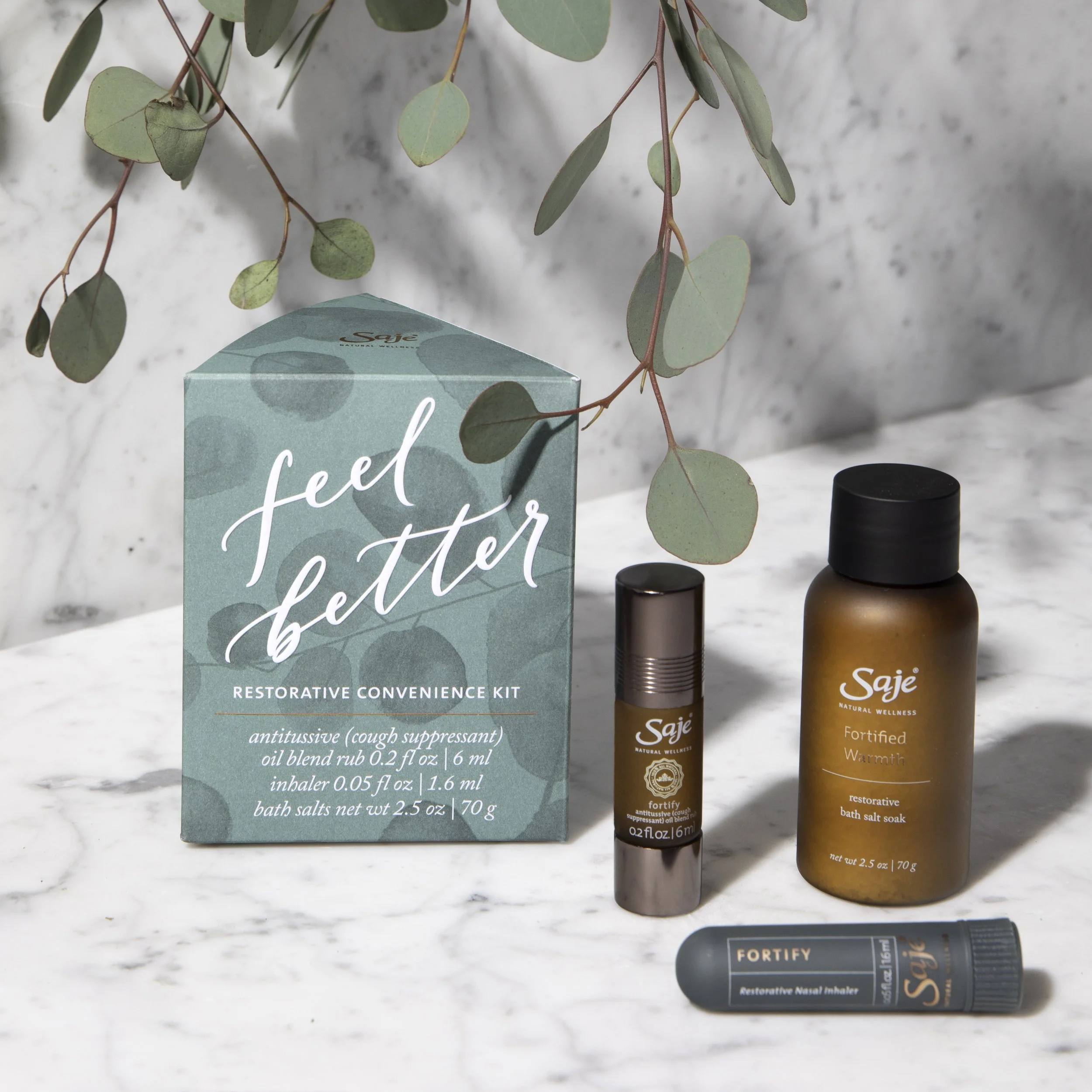
USD Packaging - Seasonal Premium
2018 Pocket Faramacy - Limited Edition
CAD + USD Markets
S M A L L I N N O V A T I O N S.
B I G I M P A C T
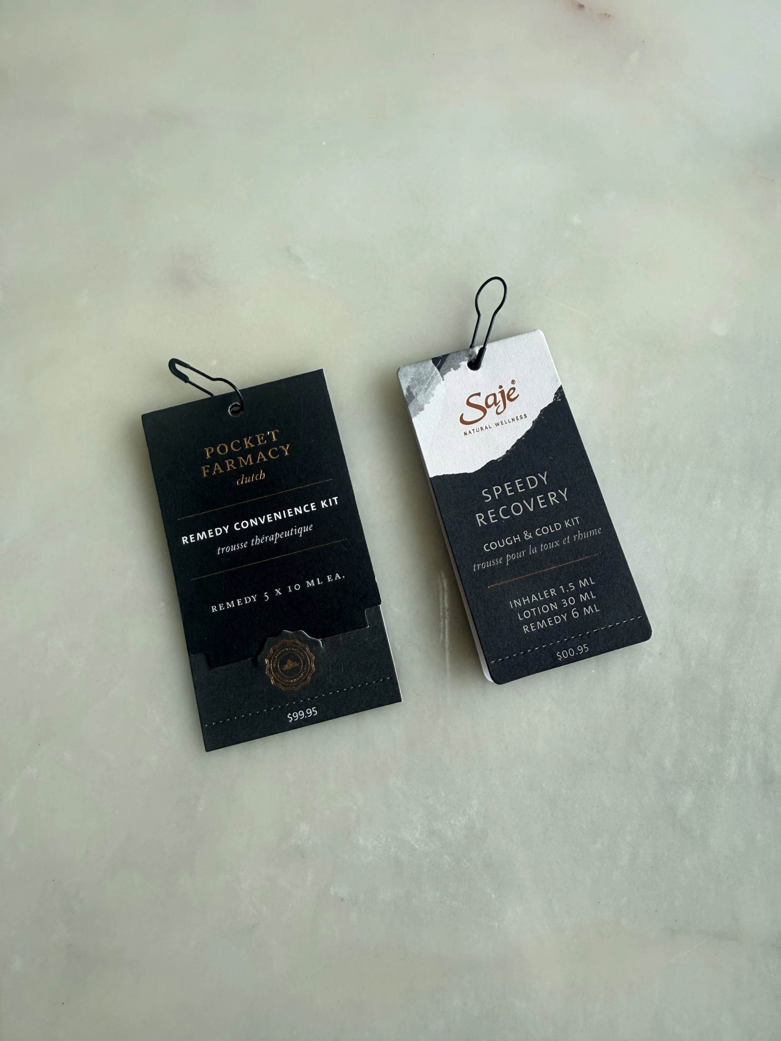
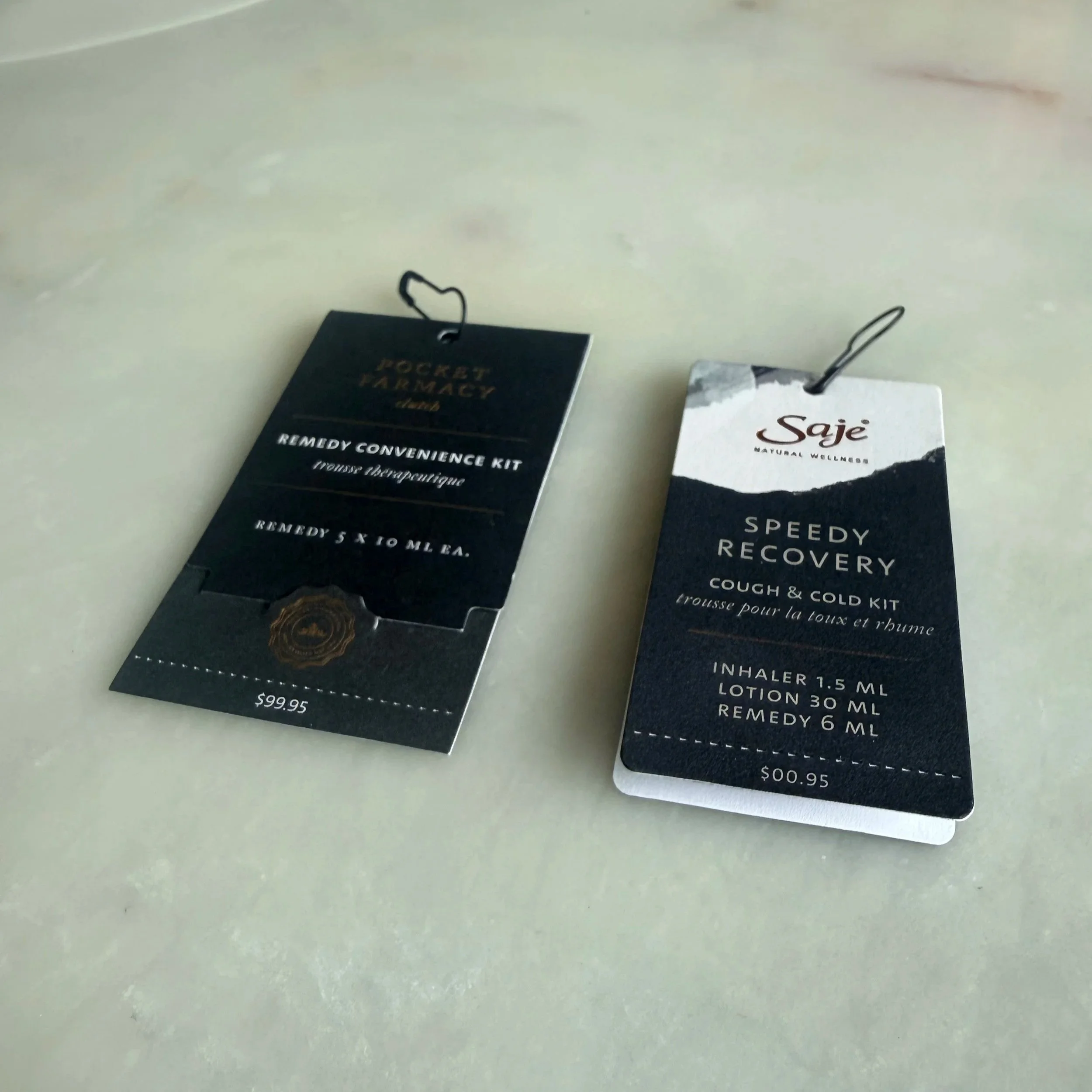
When I noticed the Pocket Farmacy product tags were prone to falling apart in-store (pages sliding loose, undermining the premium feel) I redesigned them with a small dieline cut that allowed the cover to fold and tuck, keeping everything intact without additional materials. That tag structure remained in use for years after I left.
[in both images]
LEFT: New tag design; stays closed. Tidy and damage is less likely.
RIGHT: Old Tag, naturally pops up, easily damaged.
H O L I D A Y 2 0 1 9
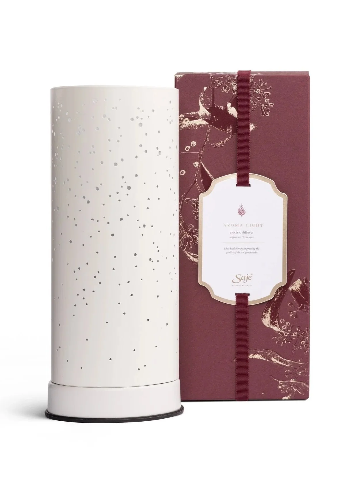
I developed the creative concept that was selected for the season: photographing botanicals on a lightbox, then isolating highlight areas for a second-pass gold foil print layer.
The direction was intentionally minimal and organic. Minimal because it mirrored Saje's commitment to reduced waste, organic because it rooted the packaging directly in the plant-derived products inside.
Where the concept needed to stretch across a full line, we brought in embossing and high gloss alongside the foil, adapting the direction into a print language that could carry consistently at scale.
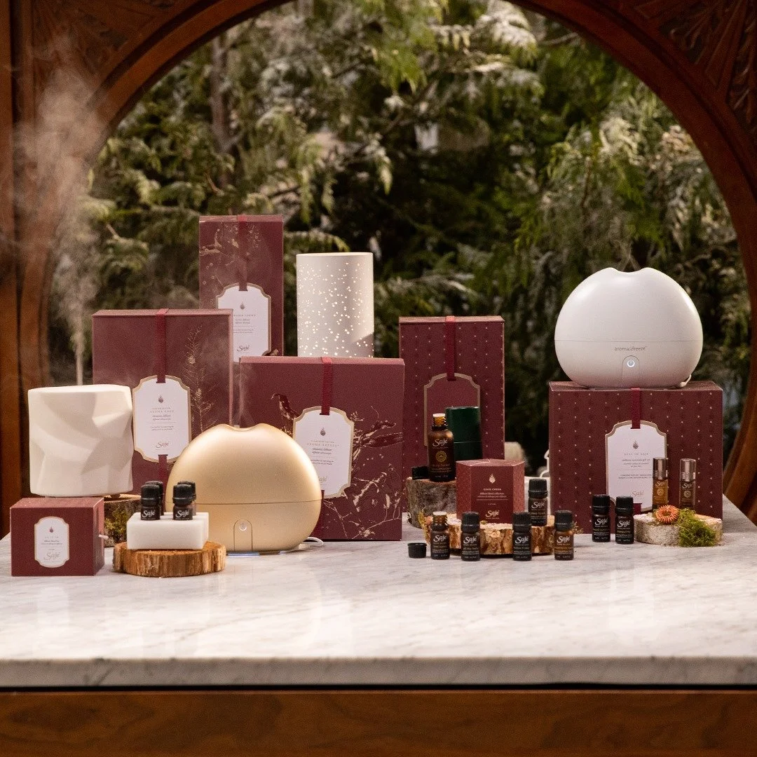
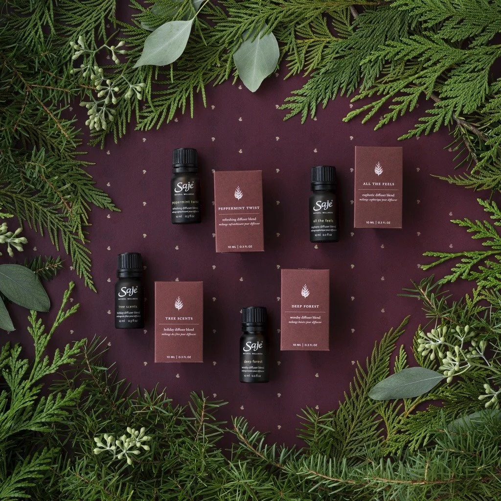
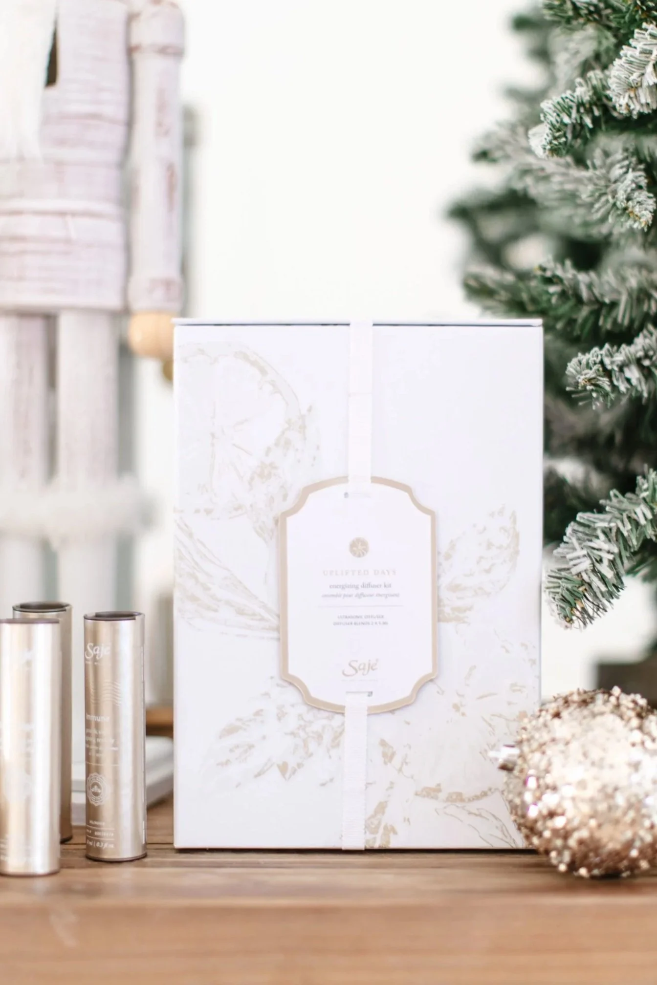
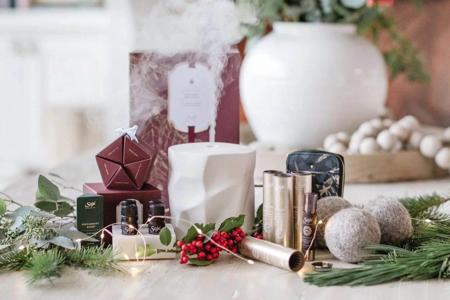
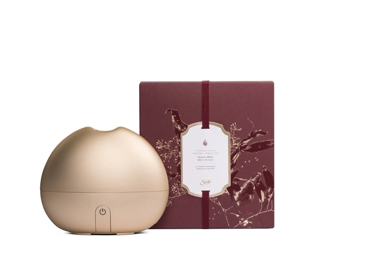
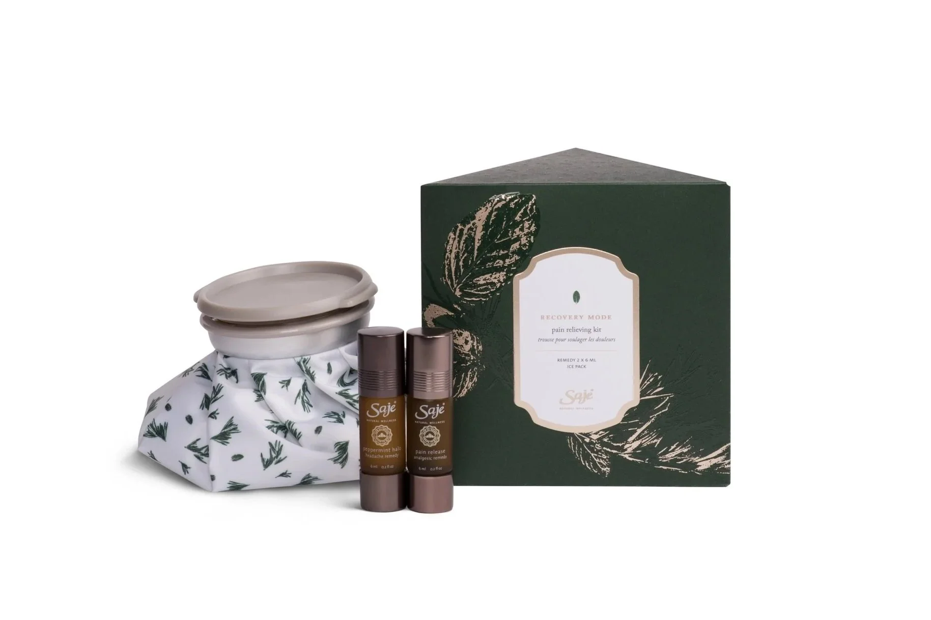

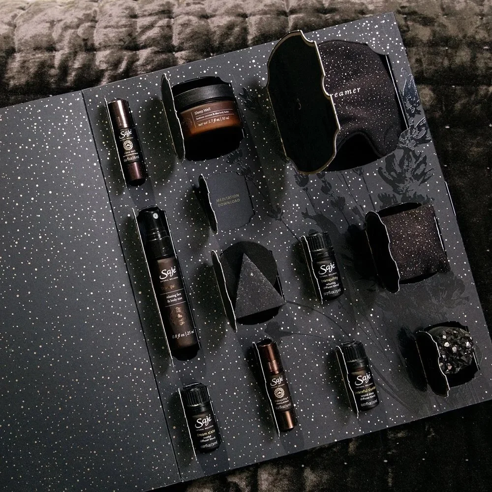

On a full product shelf, the details are what earn the reach.
Make it work in a busy marketplace. Make it a no brainer to your customers.
Beautiful & Responsible.
Beautiful & Responsible.
N E X T P R O J E C T