Epic Pharmacy Tofino
Health and wellness benefit from an integrated approach.
Opportunity
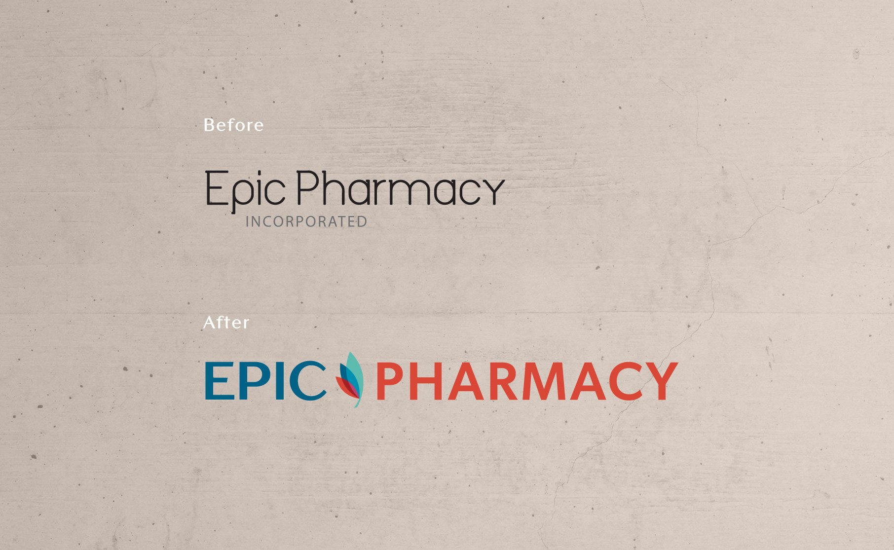
With a supportive partnership through Pharmasave and growing brand awareness, it was time to receive a professional, trustworthy and community aligned brand for this west coast pharmacy. One where the logos could sit complimentary next to the Pharmasave logo.
Outcome
A visual identity connected to all three aspects and pillars of the brand, inspired by a special audience group and exuding the same level of trust, growth and uplifting health support you can expect to find at Epic.
Scope
Rebrand
Visual Identity (logos x3, type system, color system)
Icons
Website

Who is this business?
Providing traditional pharmaceutical as well as alternative wellness options, alongside events and workshops, Epic is a pillar within the Tofino community. Weather you need support understanding your medications or you’d like to also integrate organic teas and supplements, Epic will meet you with kindness and an open approach no matter who you are or where you’re at in your health journey.
Epic’s aim is to provide an integrated approach to health for everyone.
Audience
Absolutely dynamic, this pharmacy has 3 main audiences to speak to:
Older audiences (50+) who rely on pharmaceuticals to keep them balanced and living a less painful life daily.
Young adults (25-35) who may be blending pharmaceuticals with the support of alternative wellness options such as epson salts, organic teas and regular yoga.
Indigenous community members looking for health and wellness support and have specifically commented on Epic’s ability to welcome and respect them as customers.
Brand Personality
Balanced between professional and down to earth, that expert you can trust but is also your friend.

Logo Meaning
Layered colors express the businesses belief in integrated health:
Blending different modalities, practices and approaches can provide an incredibly supportive health experience that is both long lasting and balanced. There is no one way to experience good health.
COLOR
Using color psychology:
Red= The Pharmacy
Denotes: physical needs, strength, power,
Navy= Tofino (the coastal location)
Denotes: trust, courage, reliable, mentally soothing and relaxes the nervous system.
Teal= Wellness (the alternative health practices)
Denotes: growth, harmony, balance, reduces stress, nature.
Logos & Submarks
This visual identity kit comes with 3 logos.
Primary: Epic Pharmacy
Epic Pharmacy
Encompasses the business as a whole. Used when speaking about the business as well as specifically for the traditional pharmaceutical aspect of the business.
Submark: Wellness
Supporting more than the traditional western forms of health, this logo is utilized for the alternative supportive forms of health such as yoga, tea’s, salt lamps, bath salts and more.
Submark: Tofino
Nestled in Tofino, a popular tourist destination, this logo is utilized on merch and unique offerings specific to Tofino. A way to highlight locally made goods as well be a highlighted item reminding you of your coastal vacation.


Made for ease with community in mind.
User friendly, warm, minimal and to the point, Epic’s website was re-vamped to meet their new brand standard and continue leading as the community health experts they are.
Customers can now show online, learn more about products and book health appointments such as flu shots.


