
Cameron Contracting
Opportunity
With over 35 years of building experience, Cameron Contracting–a family-owned, transparent company producing high-calibre and innovative work–has established themselves as an industry leader in home building in the Comox Valley.
While their work is both technically and visually excellent, their branding needed to express the same level of quality and strong professionalism while remaining warm and friendly.
Outcome
After a brand strategy session, market analysis and consideration of their values as well as what it means to have a home, a strong, clean yet youthful brand was designed with a geometric visual mark that clearly said “we build homes”.
Scope
Re-brand
Brand strategy
Market Analysis
Visual Identity (logos, type, color)
Brand Tone + Personality
Brand Manual
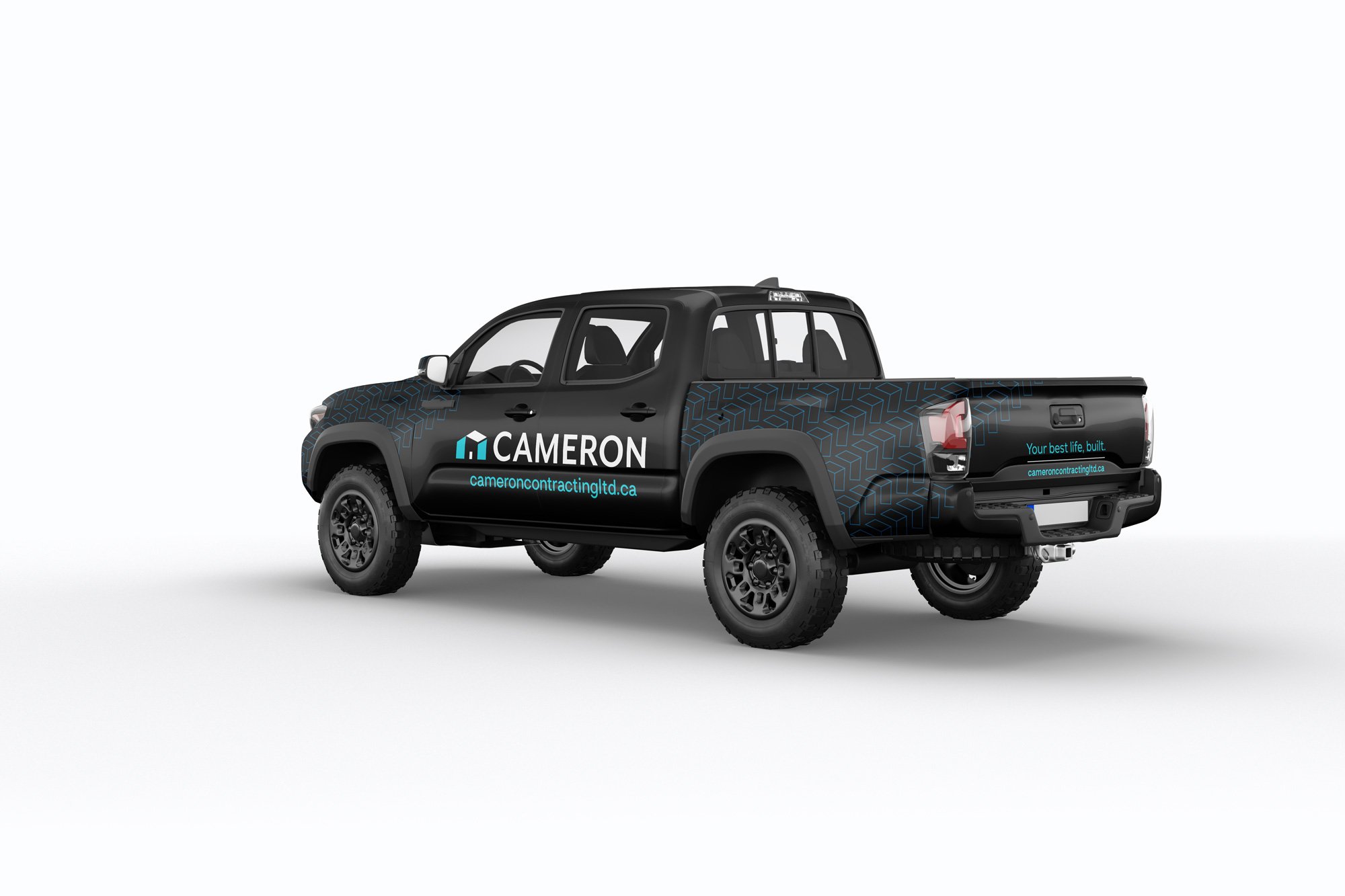
Business cards
Website

Who is this business?
Cameron is a home building business in the Comox Valley who approaches each project with the mindset that your house is not just your home, it is the center of your world–and your world should be well built.
Family owned and operated, they bring the same joy, laughter and togetherness that can be found at their own dinner tables to their teams and client relationships.
Audience
Their primary audience was that of young families–mom and dad in their 30s-40’s with two young kids–moving into their first or maybe second home, but one that finally has the right kind of space to support their lifestyle.
Additionally, they also connect with clientele who are purchasing a second or vacation home or are interested in building a custom legacy home–that waterfront property that the kids and grandkids love visiting during the holidays.

Brand Personality + Written Tone
Family is the foundation to everything they do–truly. So while leadership and expertise were core to the brand’s expression, a sense of family was there too: the kind that laughs a lot, tell’s witty stories and at the end of the day, always has one another’s back.
This lead us to create something clean and professional with a bit of wit and playfulness be it in the visuals itself, or the written language of the brand.

Logo + Meaning


Your house is more than just the four walls that keep you warm at night. You live your best life both in and outside those walls from holiday dinner parties to the BBQing or gardening out back.
We gave them a logo option that clearly showed the form of a house with an optical illusion that alluded to this concept.
In addition, it also holds the classic form of a house, while also showing a more contemporary form.
Designing the house out of three main shapes also points out the owners own story of how they work: while talented individually, they’re a powerhouse when working together.


Color
Colors expressing trust, innovation, joy and construction were selected.
Why?
Understanding this businesses construction and customer experience process as well as how much their customers raved about feeling taken care of and excitement through the process is what brought our color selection home.
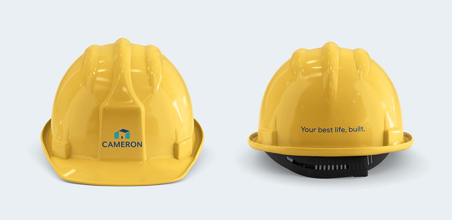
Cameron Hard Hat's

Manifesto, a contemporary way of expressing values to clients.
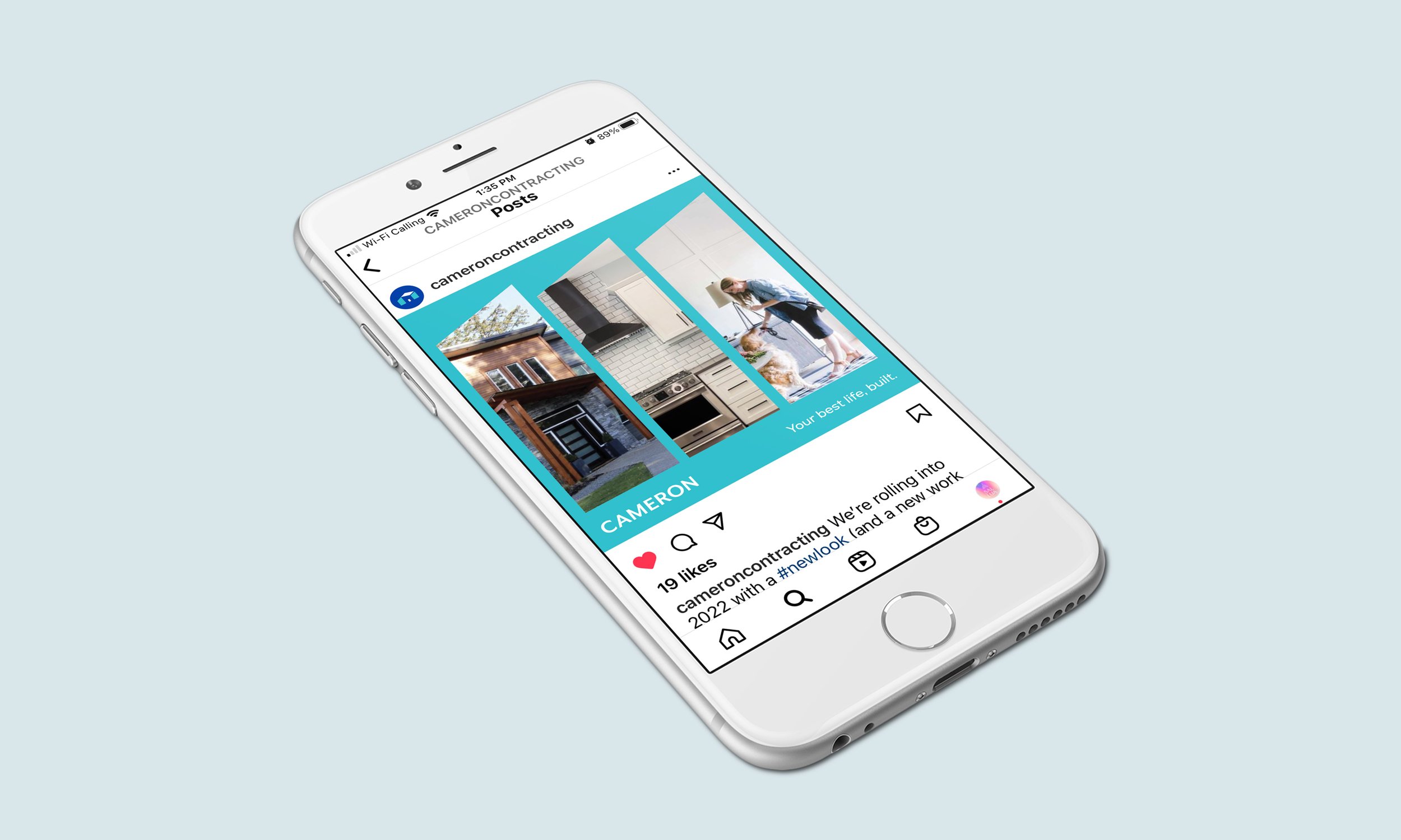
Social Media example templates

Social Media example templates

