
SoulBody Co
How to come back to your inner wisdom via breathwork.
Opportunity
Arriving with a business they were passionate about and a visual identity that once hit the mark but now fell flat, they were looking to refresh what they had rather than completely strip away and start anew.
Outcome
Completely original and finely tuned into the services of the business, this brand was infused with meaning at every step of the way. With a new logo kit that included new type system and an updated color palette offering a more rounded expression of being human (form gentle to passionate) as well as new icons and textures inspired by spirituality and breathework.
Scope
Rebrand
Visual Identity (logos, type system, color system)
Visual Textures: photographic
Graphic-Textured Icons

Who is this business?
Soulbody is a company providing the soul expanding experience of breathwork–a powerful self-healing modality–with the mission to guide their clients back to love, abundance, and freedom.
This returning is liberating and healing. Thus we wanted a rebrand that spoke to this renewed spark of the heart.
Audience
Working primarily with woman and those identifying as such, Soulbody, works with those who knew there was something more out there but wasn’t always sure how to access it, a way to return home; to the heart; to the soul. They are curious of what lays beyond the tangible and hold an inkling that there is an alternative way to living than the traditional western-hustle.
Brand Personality
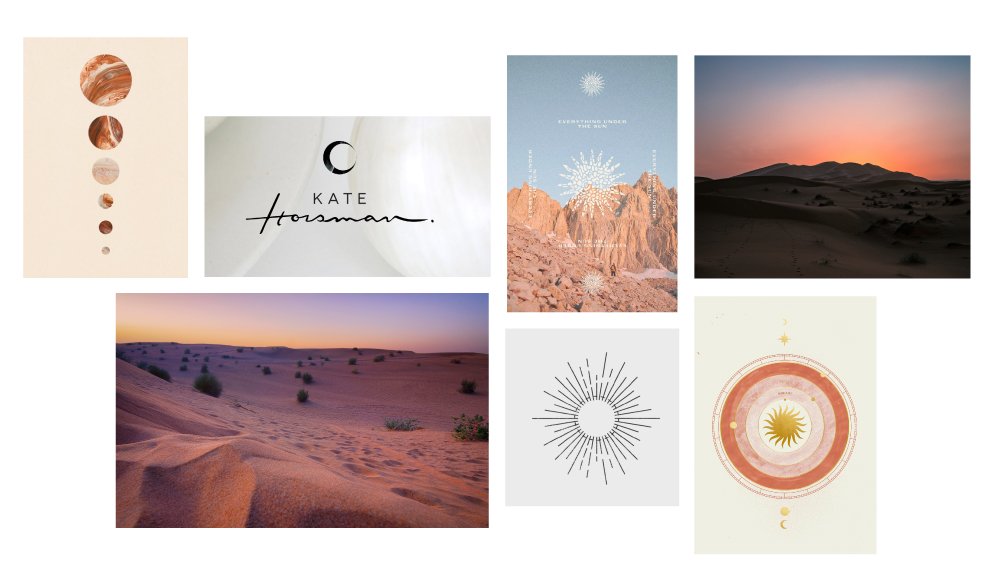
Moodboard

Color and Image Textures
Born from the love of beach and dessert: the replenishing rebirth sensation of water, both washing away and holding us in a nurturing bath as well as the feeling of being alone in a vast space of endless sandy horizons. This brand had to be soft, gentle, nurturing, feminine, luxurious and have a depth to it that went beyond the surface.
COLOR
Inspired by the rich reds, oranges and pink hues of the desert and sunrises, as well as natures warm sands, refreshing greens and blue oceans and lastly, the silky soft floral petals that show the gifts of the blooming process.
TEXTURE
Chosen to reflect the process of healing and transformation which breathwork offers, we borrowed hard surfaces such as crystals, canyon walls, rock and turbulent waters to convey more uncomfortable aspects. Softer imagery such as petals, sand, still water and silk convey the feeling of a warm embrace, sweet surrender and love.


Nine custom elements
Designed to support the brand and directly inspired by Soulbody’s process, service and program design. They fit into phrases such as “deep dive”, “mis-aligned”, “tapped in”, “manifesting, “heart space”, “intuitive gifts”, “ground”, and more.


