Befriend your customers with good typography

If you have a brand or a business and you’ve worked with a designer or you spend a pinch of time on the internet looking at what others are doing, you’ve probably seen some pretty fantastic ad’s and heard someone say that “typography and fonts matter in your brand!”
Really? Type? But it’s just pretty letterforms right? What does it matter? Trust me, it does and here’s the inside scoop.
First, just know the word “Fonts” refers to the weight of a particular type, while a Type or Typeface refers to a collection or family of fonts. So you’re going to see me use the word Type/Typography more. For example, the pink letters below are all from the Arial typeface (family), which comes in multiple fonts (styles):

Ok here’s the golden ticket:

Typography is expressive. Thats it’s. That’s why it matters.
If you think a little deeper you might realize that expressiveness is how we show our personality; we might be naturally funny and able to make light of sticky situations or make other circumstances feel more relatable through humour.
Someone might be really kind, patient, nurturing–that friend that always has our back.
And other people might be really expressive with personalities that feel more bohemian or Tiffany & Co luxurious. So our personality is what draws others to us and later develops into friendships.
When people like your personality they:
Can relate to you more easily
Are more likely to stick around and get to know you
When they know you, they enjoy spending future time with you
Leading them to trust you more as well as have your back.
And isn’t that all things you want your customers to do with your business?
Picking a good typeface makes you a magician…or at least the type will act like one.
Picking a good typeface–one that is well made, balanced in the thickness of the lines, has equal spacing between letters, is easily readable (unless it shouldn’t be based on your brands personality–ha!), then this typeface, paired with good copywriting is a magician at inviting others to come meet you; to come get to know you and hopefully, like what you’re up to enough to stick around.
Letters are ultimately shapes. And shapes are building blocks - one of the first things as infants we learn. So just imagine how evocative they are to us? Imagine how these shapes subconsciously tap into experiences which fire off dopamine levels enough to tell us, “Hey, I like this; it’s something I should look into”.

We see 8000 ad’s on average per day…
and it really starts with a glance. The right type, the right colors and good copy? *Muah* Bellissimo! It can make all the difference.
If you’re in the midst of a rebrand or thinking of one, I highly recommend you create space and budget for well-design typeface. And if you’re not sure what that entrails well...
Stick around for Part 2: We’re talking Typography prices and what’s worth it.
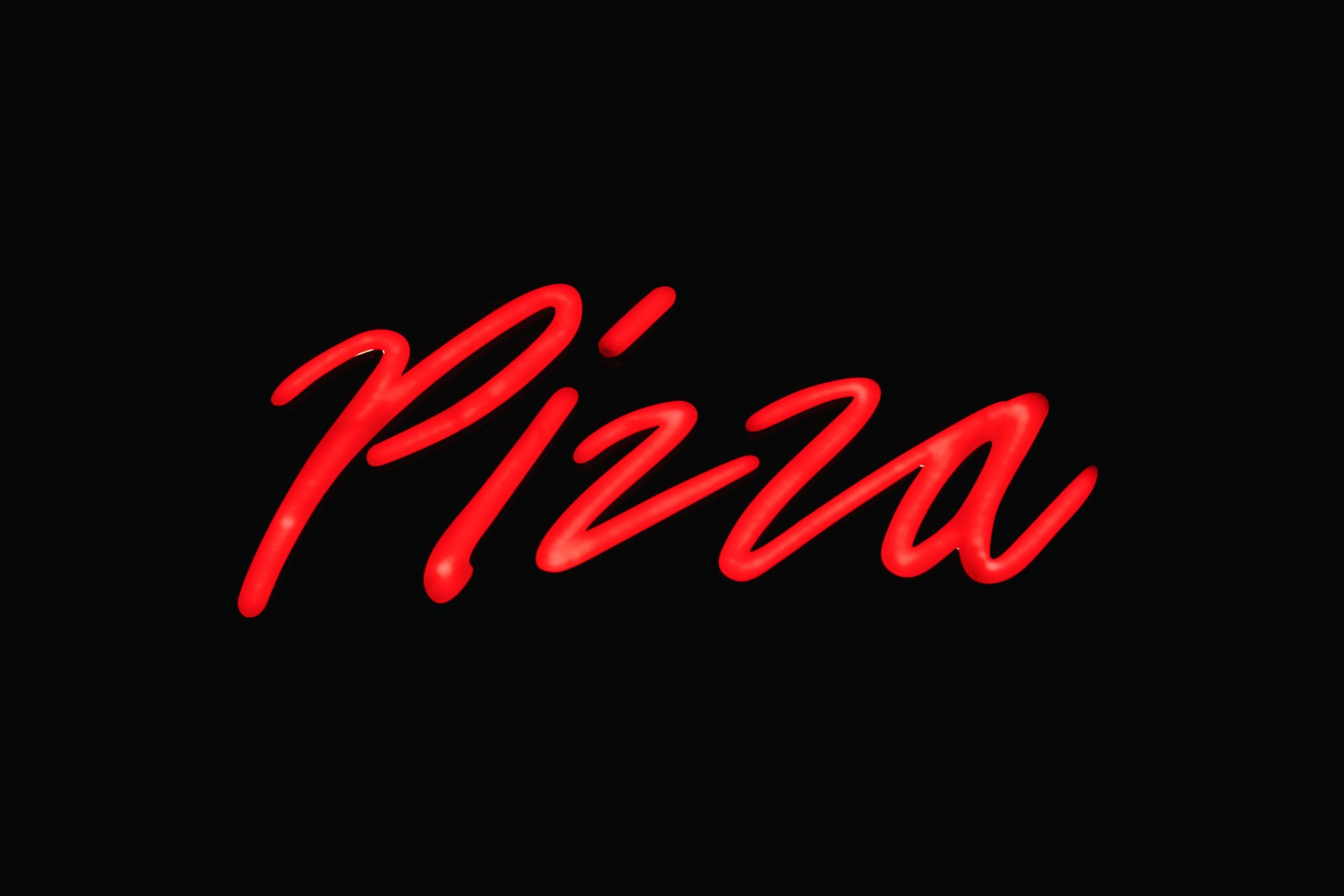
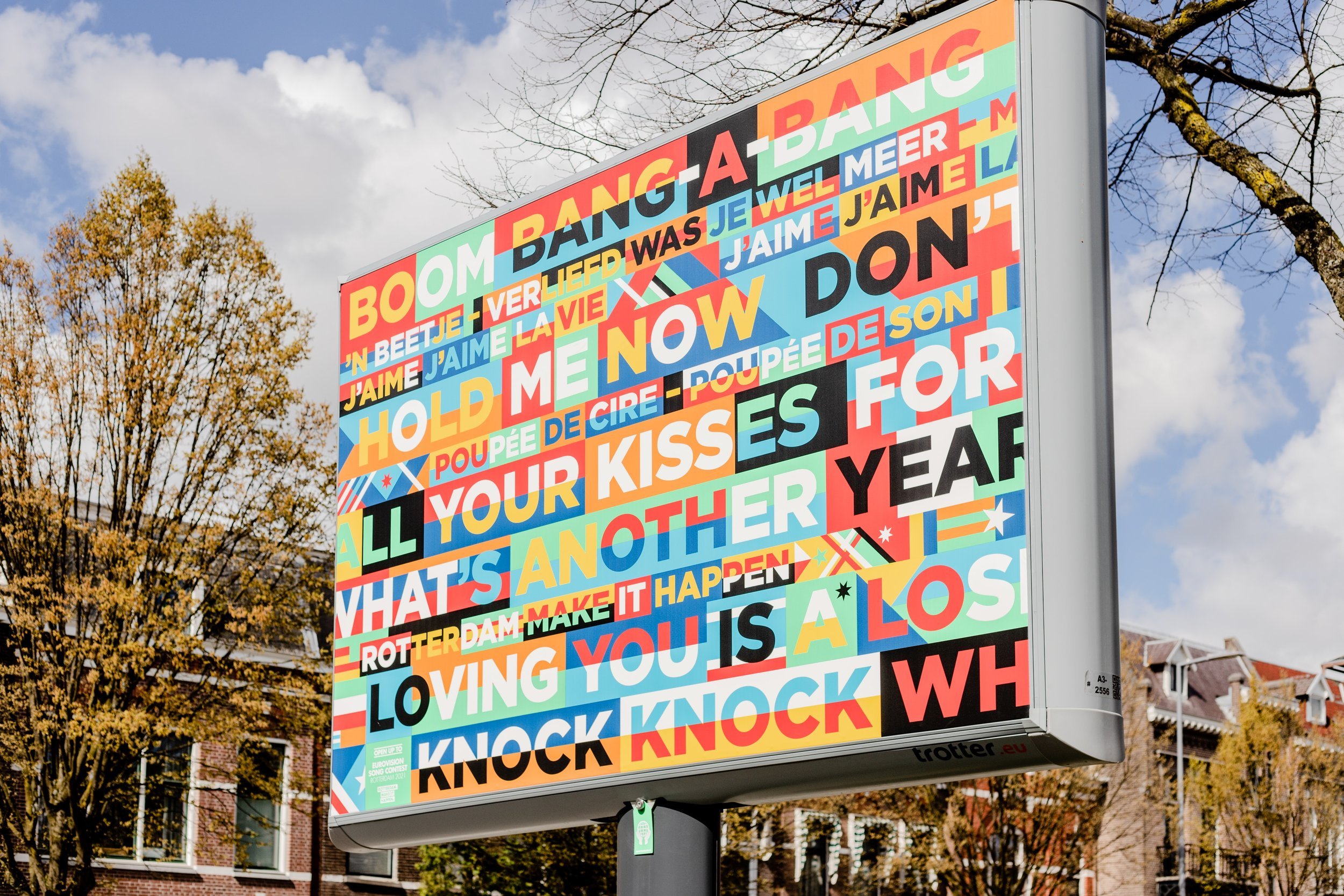
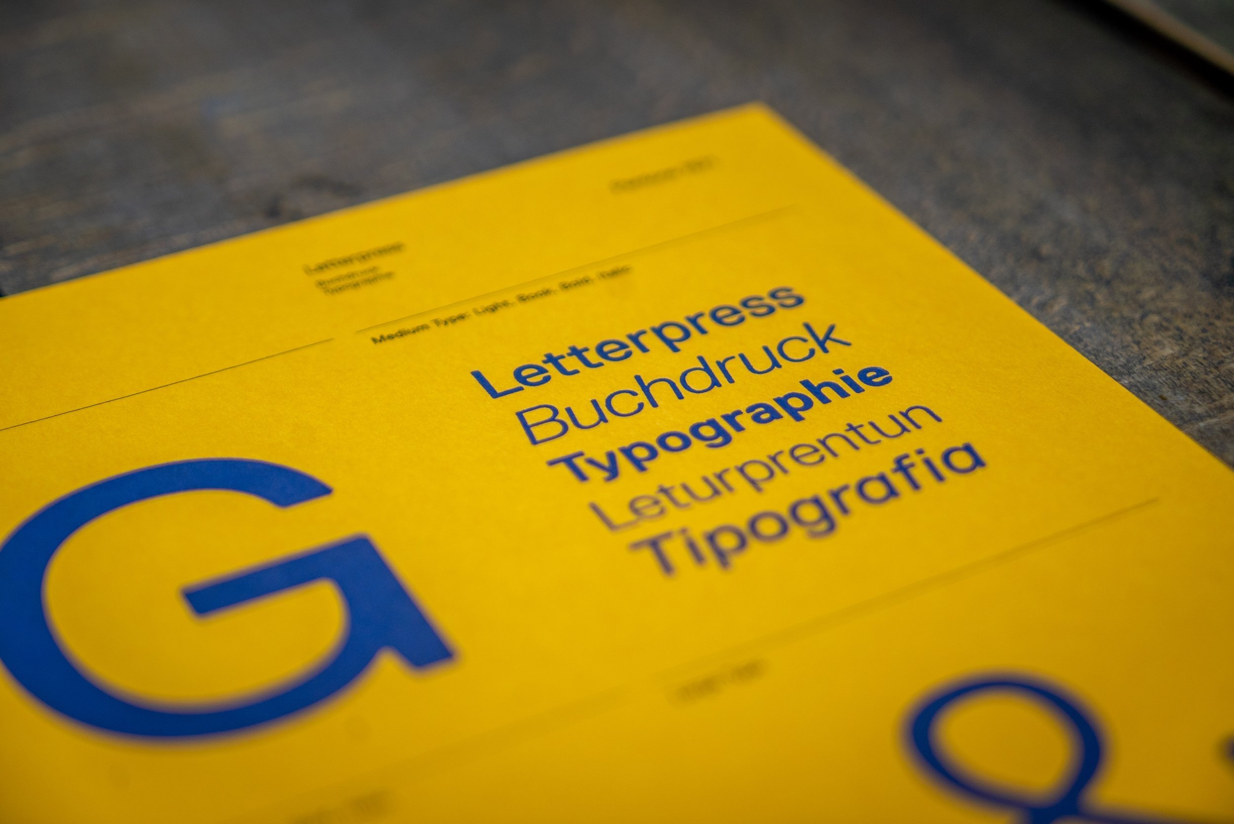
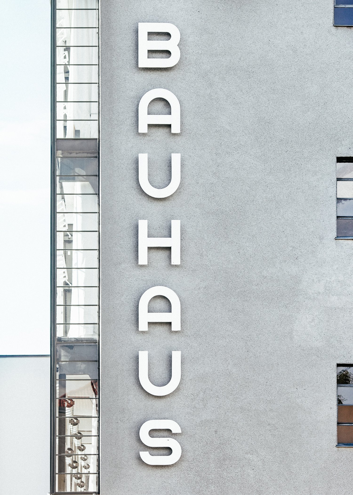
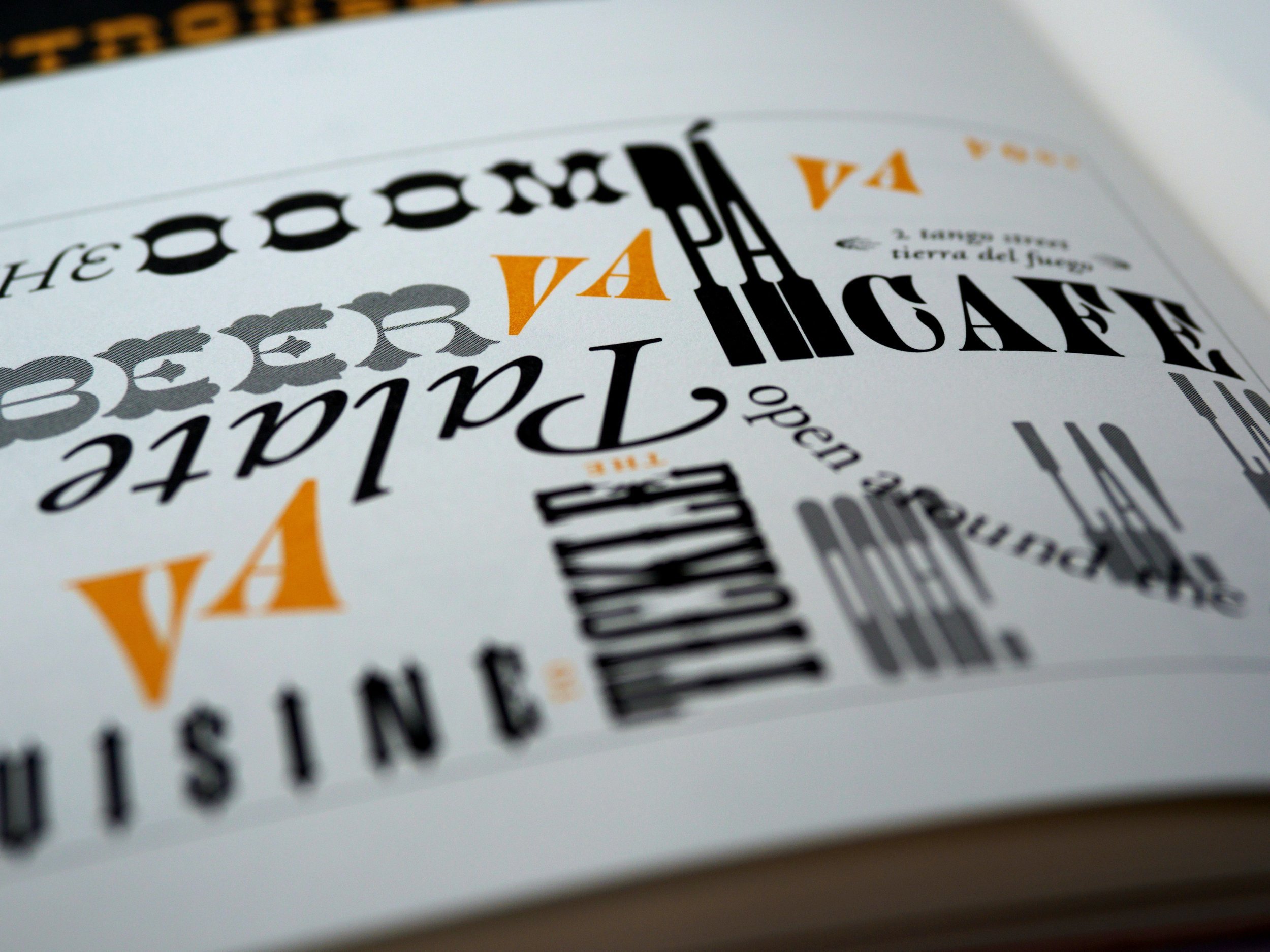
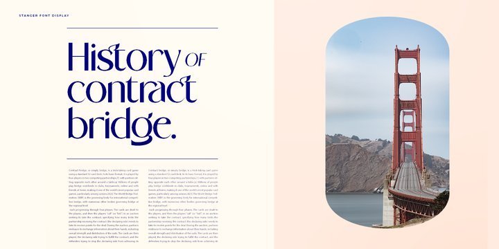
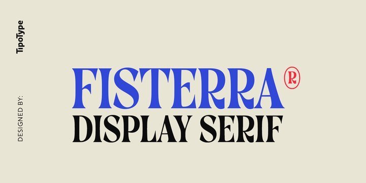
For fun, here are some beautiful images of type well designed, well laid out or used as art. *me squeeling with heart eyes popping